
Choosing the right paint color can be tricky when styling a home and finding the perfect neutral to pair beautifully with bolder tones is key. Whether I’m refreshing a single wall or designing an entire room, my goal is to always find the perfect balance between cozy and sophisticated. In no particular order, here are my top seven neutral paint colors that go with a variety of styles and lighting conditions!
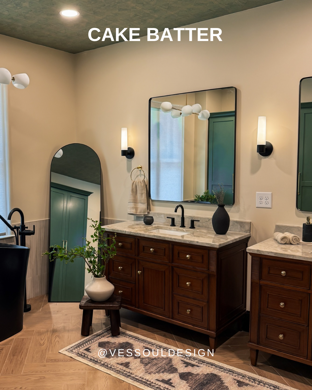
Cake Batter Paint Color.
#1. Cake Batter by Benjamin Moore is a soft, buttery off-white that instantly brings warmth into a room. I love using it in living rooms or bedrooms where natural light can bounce around, creating the perfect neutral without being too yellow.
LRV= 73.71
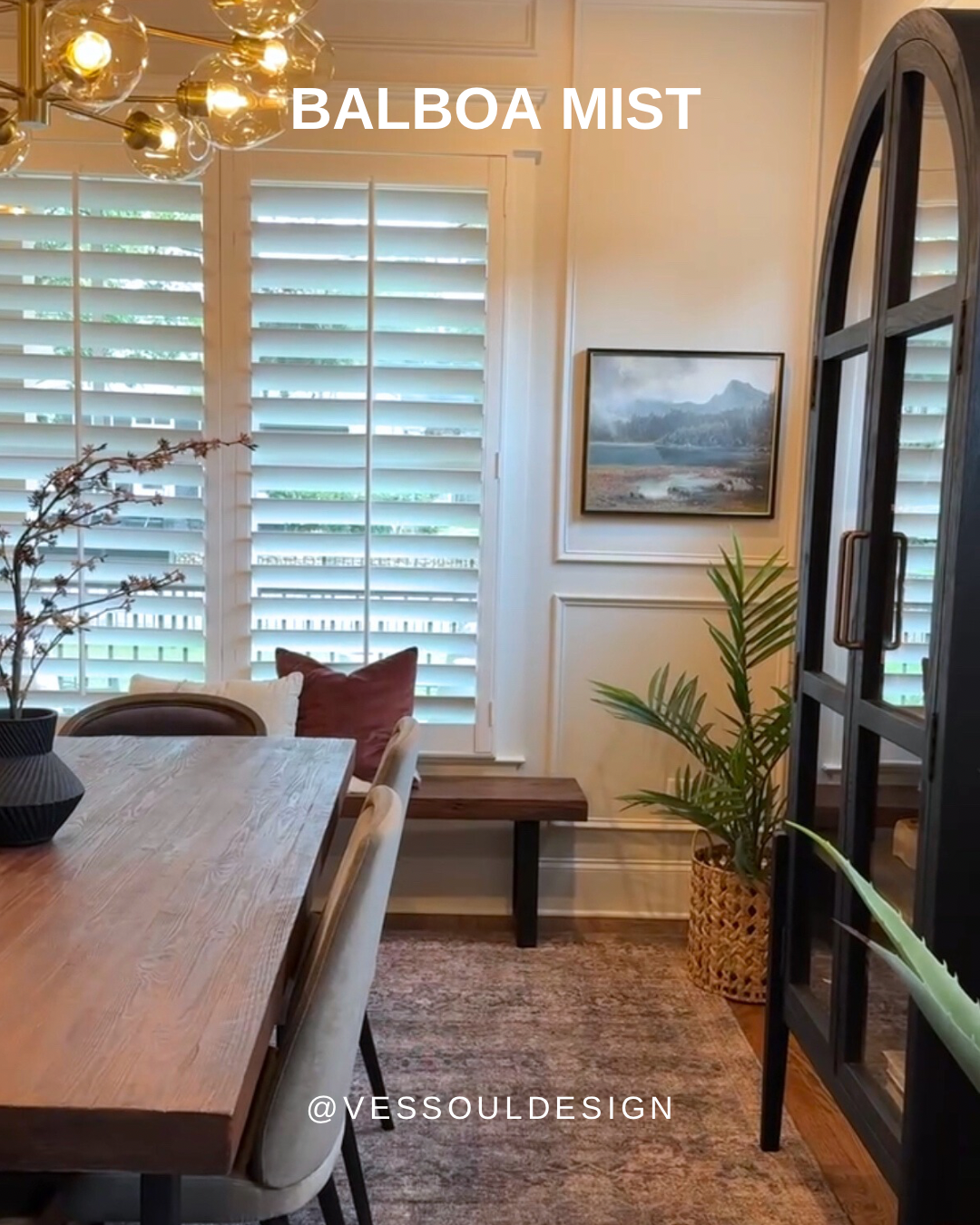
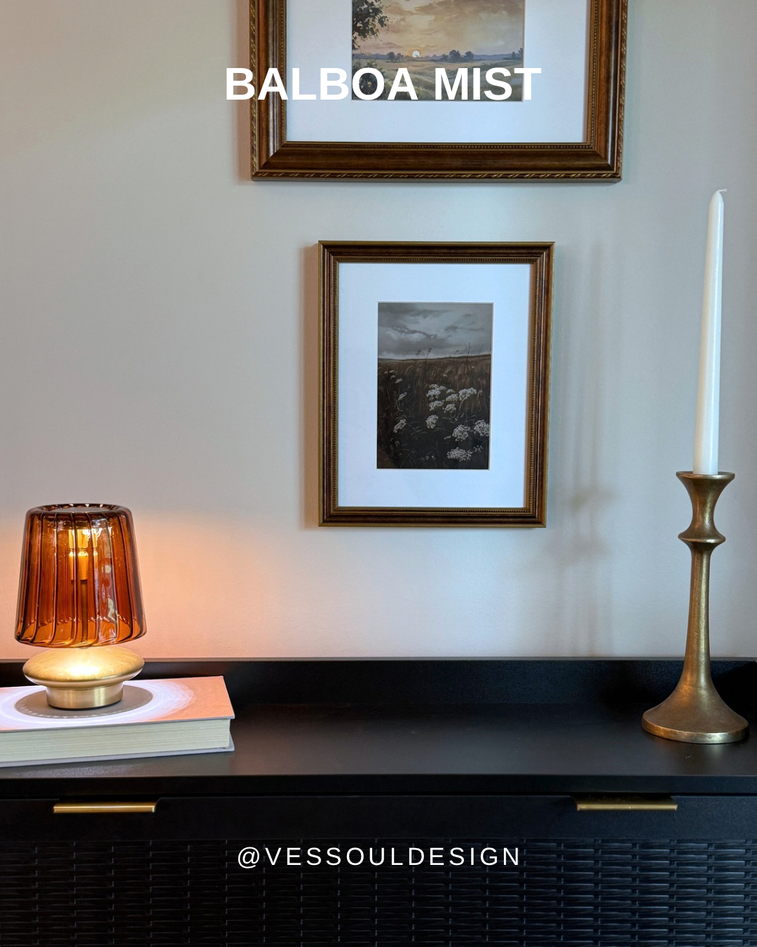
#2. Above, you’ll find Balboa Mist by Benjamin Moore. Think of this as the warm alternative to the overused “millennial gray”. It’s sophisticated but not too dark, creating an inviting space for open-concept homes or transitional spaces.
LRV= 65.53
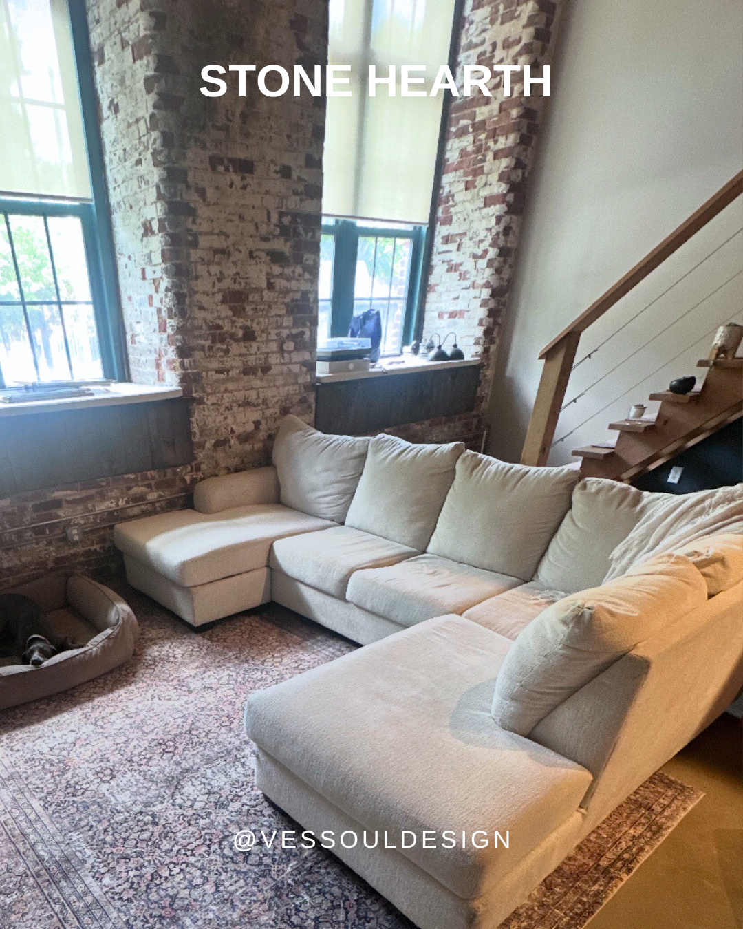
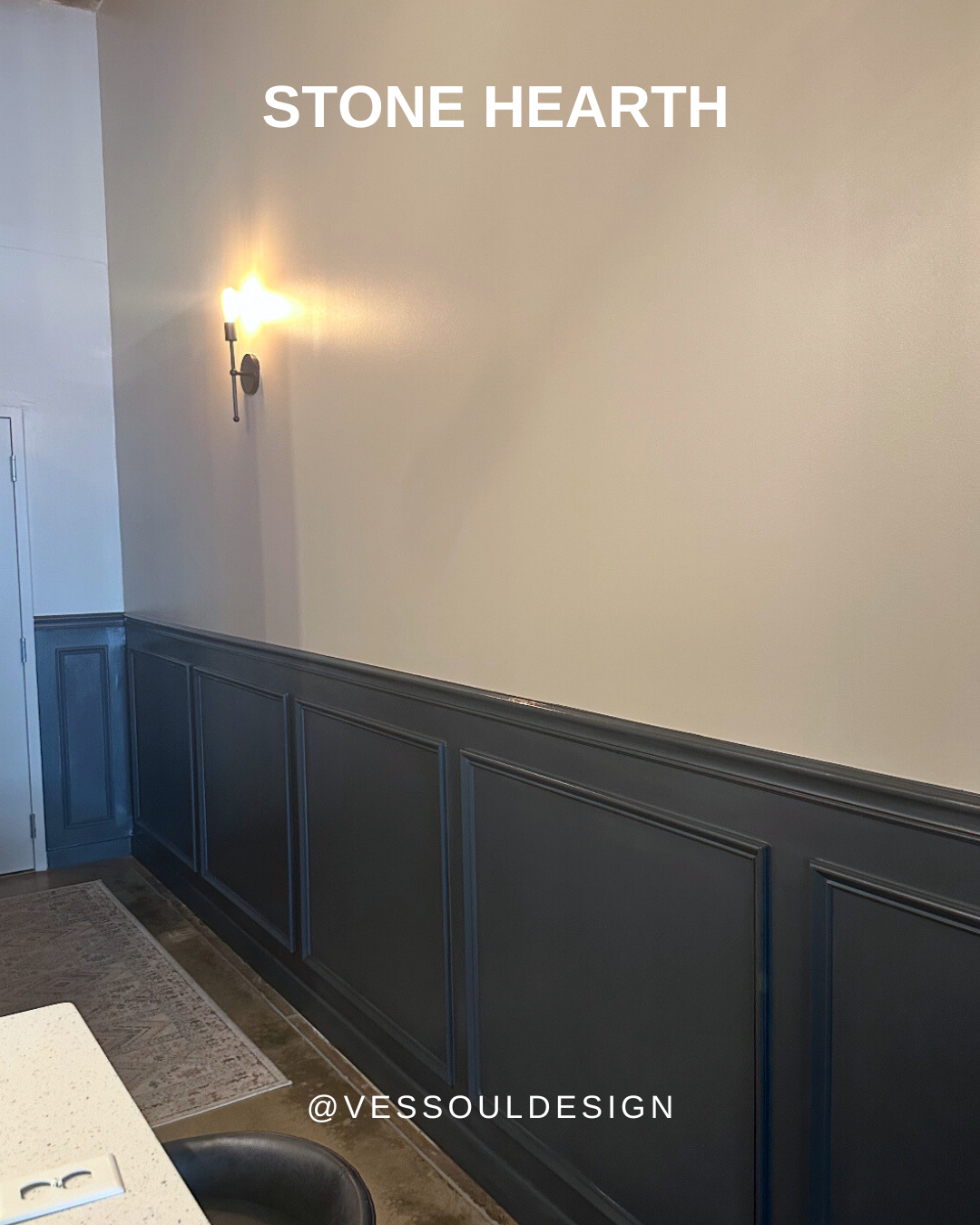
#3. Next, is Stone Hearth by Benjamin Moore. This is a soft taupe with a bit of depth when paired with something dramatic, like Wrought Iron. This works beautifully in living rooms or moody offices.
LRV= 48.45
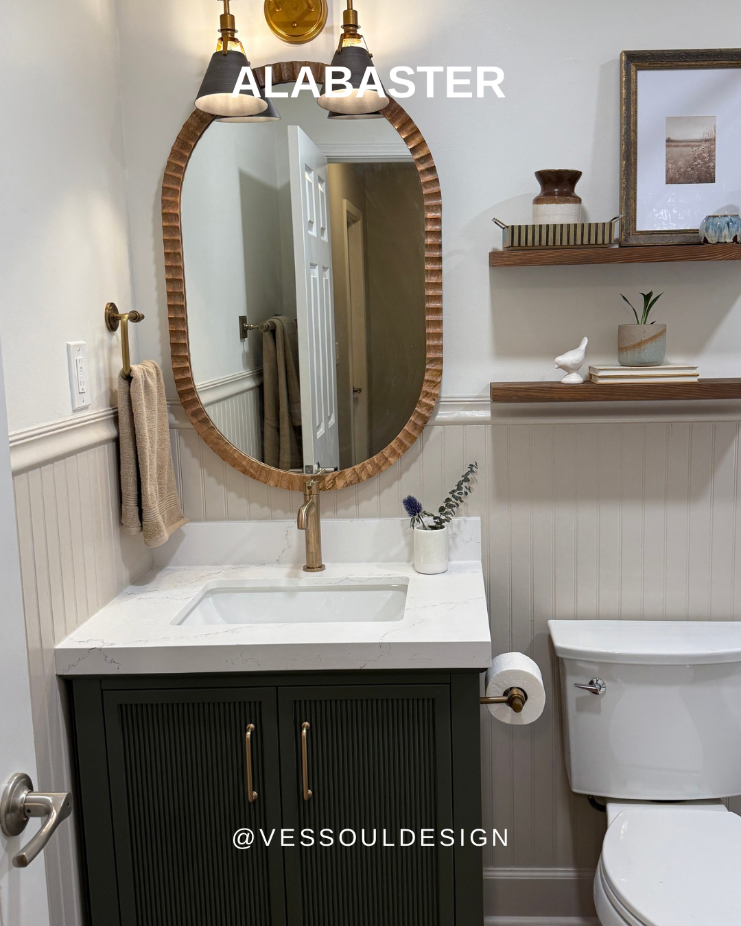
Alabaster: Wall Color
#4. Here we have Alabaster by Sherwin Williams. This is a top choice because it’s creamy and soft without tipping yellow. This hue is perfect for creating a calm backdrop in bathrooms or serene entryways.
LRV= 85.08
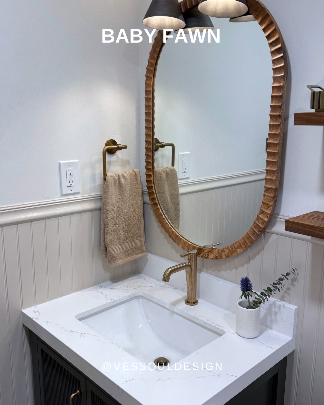
Beadboard: Baby Fawn
#5. Baby Fawn, by Benjamin Moore, pairs beautifully with Alabaster. By creating a subtle warmth that isn’t overly peachy. I adore this cozy color!
LRV= 63.09
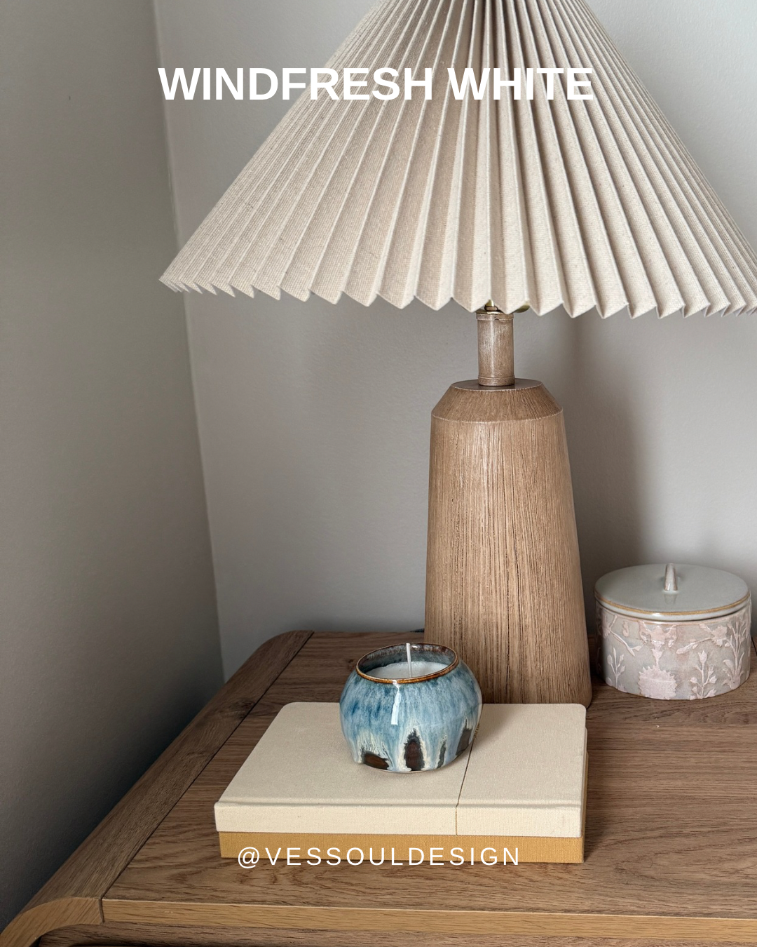
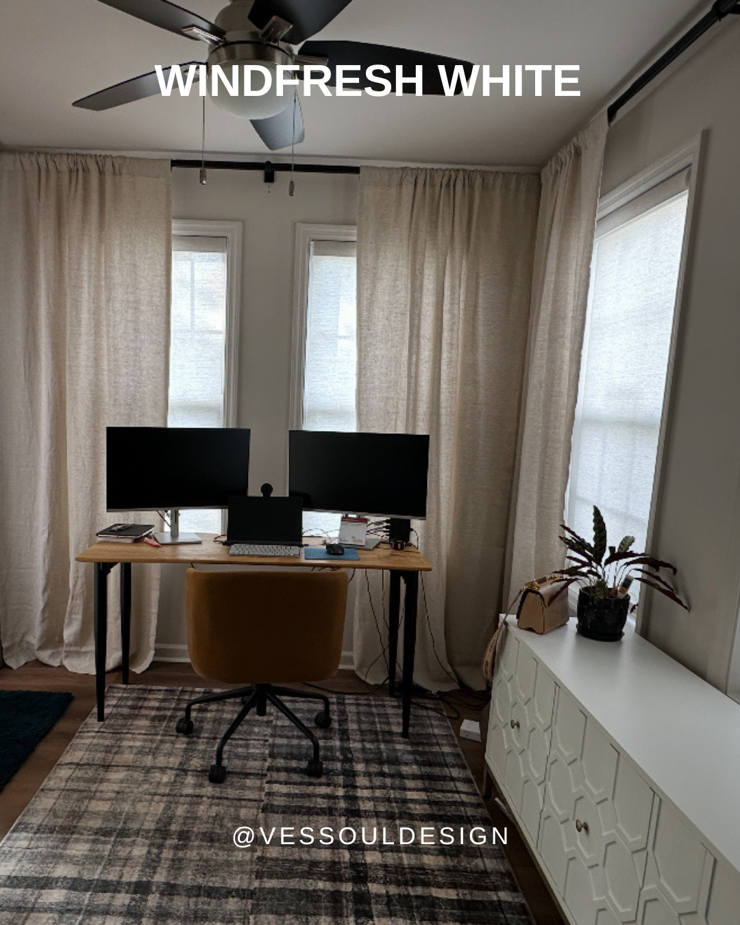
#6. If you’re looking for a color that plays well with earthy tones and cooler floors, say hello to Windfresh White by Sherwin Williams. With a small dash of violet, it reads as a soft gray in lower light - perfect for basements or office spaces!
LRV= 69
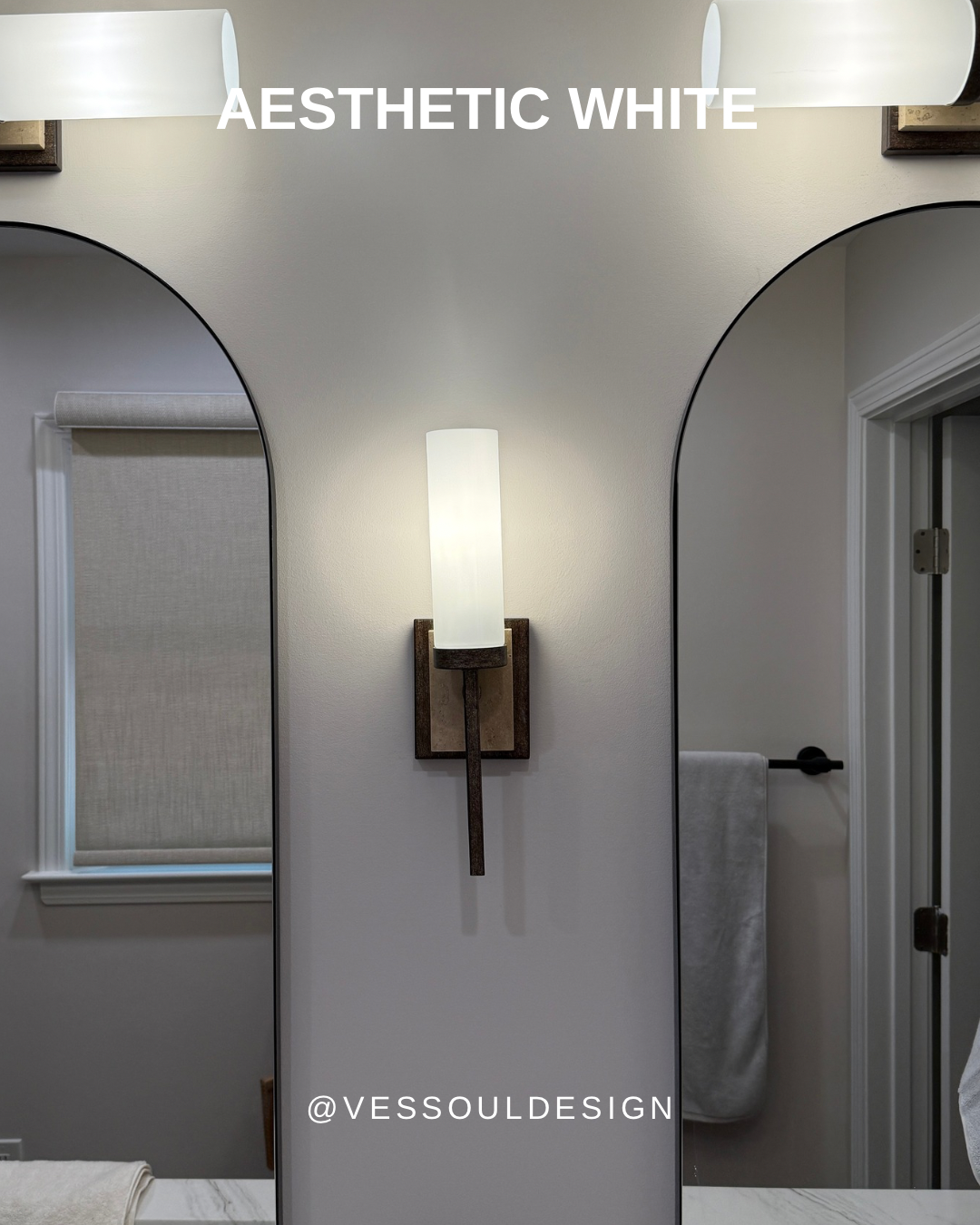
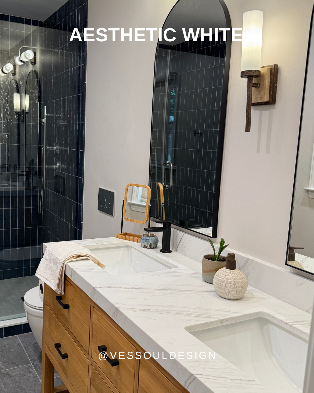
#7. Let’s not forget about Aesthetic White by Sherwin Williams. It’s a crisp, balanced neutral that isn’t too bright and blinding. It’s my go-to when looking for a color to group with blues and grays.
LRV= 73
As you can see, the right neutral shade can truly transform how a room looks AND feels. The magic is in the undertone, and these colors always find their moment to shine in the design projects I have worked on previously.