Spring/Summer Patio Styles We’re Loving Right Now
Three distinct looks, one elevated outdoor experience
(links are below)
As the weather warms and days stretch longer, outdoor living becomes less of a luxury and more of a lifestyle. The patio, terrace, or backyard transforms into an extension of the home—a place for slow mornings, golden hour gatherings, and everything in between.
This season, we’re leaning into three distinct design directions for outdoor spaces: Coastal Oasis, Boho Haven, and Modern Refinement. Each offers a unique mood, but all share the same intention—creating a space that feels effortless, layered, and livable.
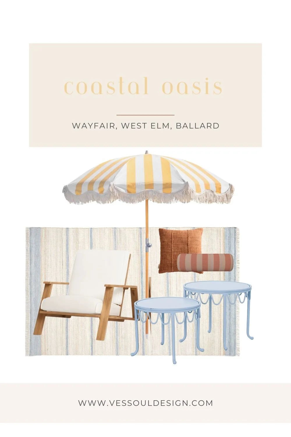
Coastal Oasis
Light, airy, and endlessly serene
This look is all about capturing that relaxed, sun-washed feeling of being near the water—even if you’re nowhere close to the coast. Think soft whites, sandy beiges, and washed wood tones paired with breezy fabrics that move with the wind.
To achieve this look, start with a neutral foundation—teak or light wood lounge furniture with clean, classic lines. Layer in cushions in crisp white or soft ivory, then build dimension through texture: linen throws, subtle stripes, and woven accents.
Accessories should feel collected, not overdone. A few ceramic vessels, glass lanterns, or rope details go a long way. Keep styling minimal and intentional—the beauty of this look is in its simplicity and openness.
The overall vibe? Calm, fresh, and quietly luxurious.
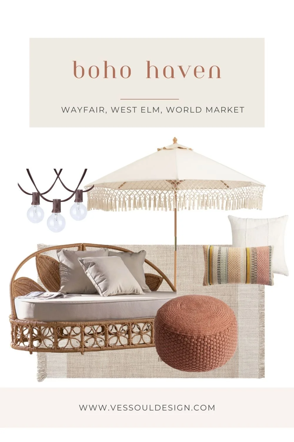
Boho Haven
Earthy, layered, and effortlessly undone
For a more relaxed and expressive outdoor space, the boho approach embraces warmth, texture, and a slightly eclectic edge. This is where comfort meets personality.
Start with low-profile lounge seating or a mix of pieces that feel collected over time. Warm wood tones, rattan, and wicker are key materials here. From there, layering is everything—think patterned pillows, textured throws, and soft, sun-faded fabrics in earthy tones like terracotta, clay, and muted olive.
Don’t be afraid to mix patterns and materials. Add in poufs, floor cushions, or even a hammock moment to enhance that laid-back feel. Greenery is essential—potted plants, trailing vines, or even a small cluster of herbs can bring the space to life.
Lighting plays a big role in setting the mood. Opt for string lights, lanterns, or candles to create that warm, ambient glow as the sun sets.
The overall vibe? Cozy, creative, and deeply inviting.
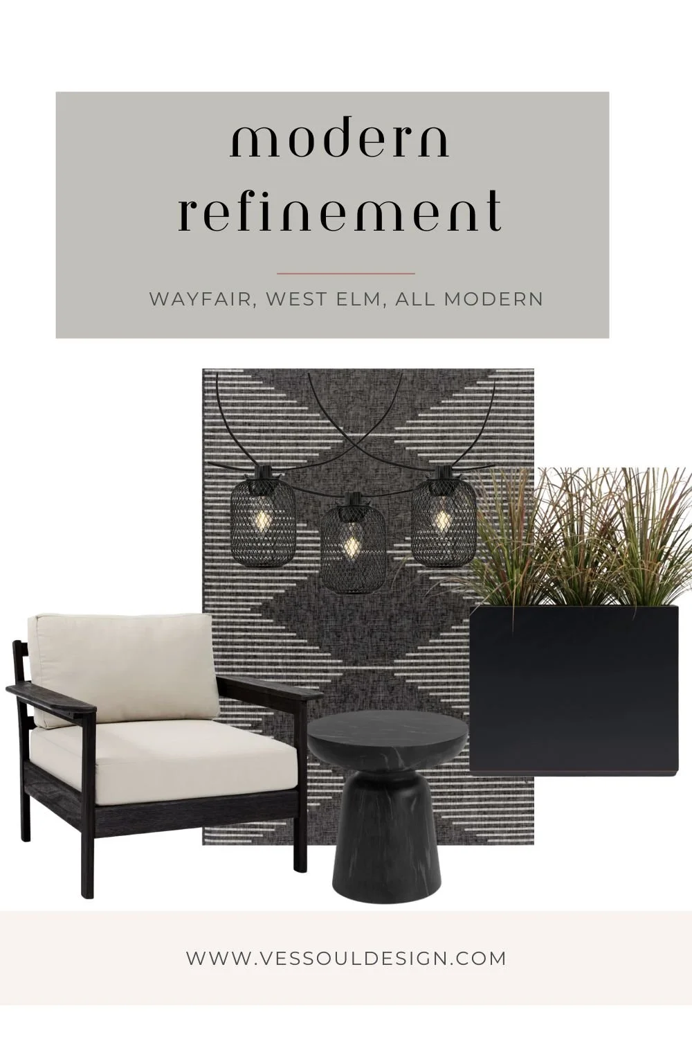
Modern Refinement
Clean, structured, and intentionally elevated
If your style leans more minimal, modern outdoor spaces are all about precision and restraint. Every piece should feel purposeful, with a strong focus on form, proportion, and materiality.
Start with streamlined furniture—metal or dark wood frames with crisp silhouettes and tailored cushions in neutral tones like charcoal, taupe, or soft gray. Keep the palette tight and cohesive to maintain that refined, architectural feel.
Instead of layering with lots of décor, focus on a few impactful elements. A sculptural coffee table, oversized planters, or a statement umbrella can anchor the space without overwhelming it.
Symmetry and spacing matter here. Give each piece room to breathe, and be intentional about layout to create a sense of balance and calm.
The overall vibe? Polished, modern, and quietly bold.
Bringing It All Together
No matter which direction you’re drawn to, the key to a well-designed outdoor space is thoughtful layering and a clear point of view. Start with foundational furniture, build in texture and comfort, and finish with details that reflect how you want the space to feel.
Whether you’re creating a breezy coastal escape, a cozy boho retreat, or a sleek modern lounge, your patio should feel like an extension of your lifestyle—effortless, elevated, and ready to be lived in all season long.