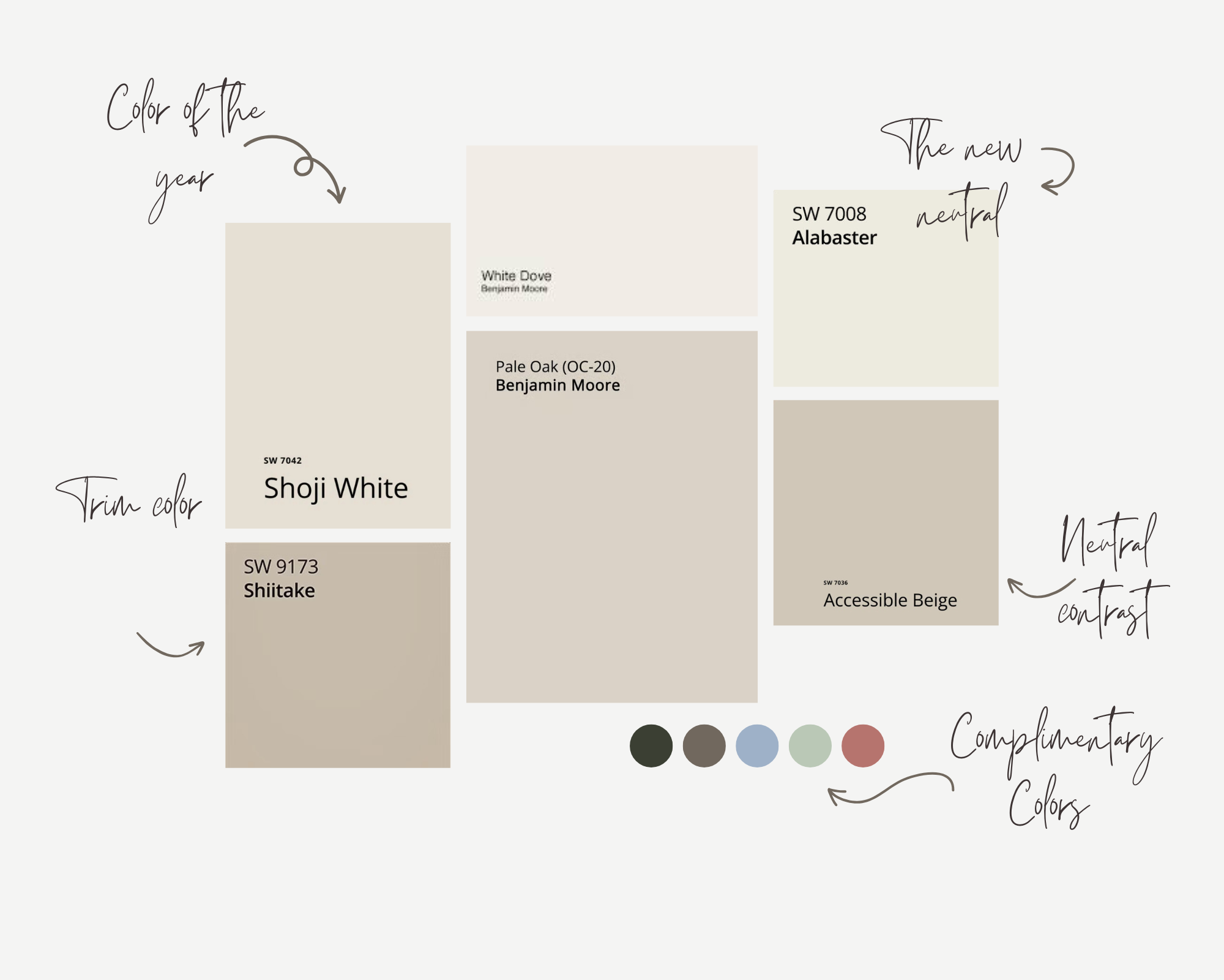
The Paint Palette Behind This Project (And Why It Works)
Paint is one of the most powerful elements in a space, yet it’s often treated as an afterthought. In reality, it sets the entire tone for how a home feels—soft or stark, warm or cool, elevated or unfinished.
For this project, the goal was to create a palette that felt timeless, layered, and effortlessly refined. Every color was chosen with intention, not just for how it looks on a swatch, but for how it lives within the space.
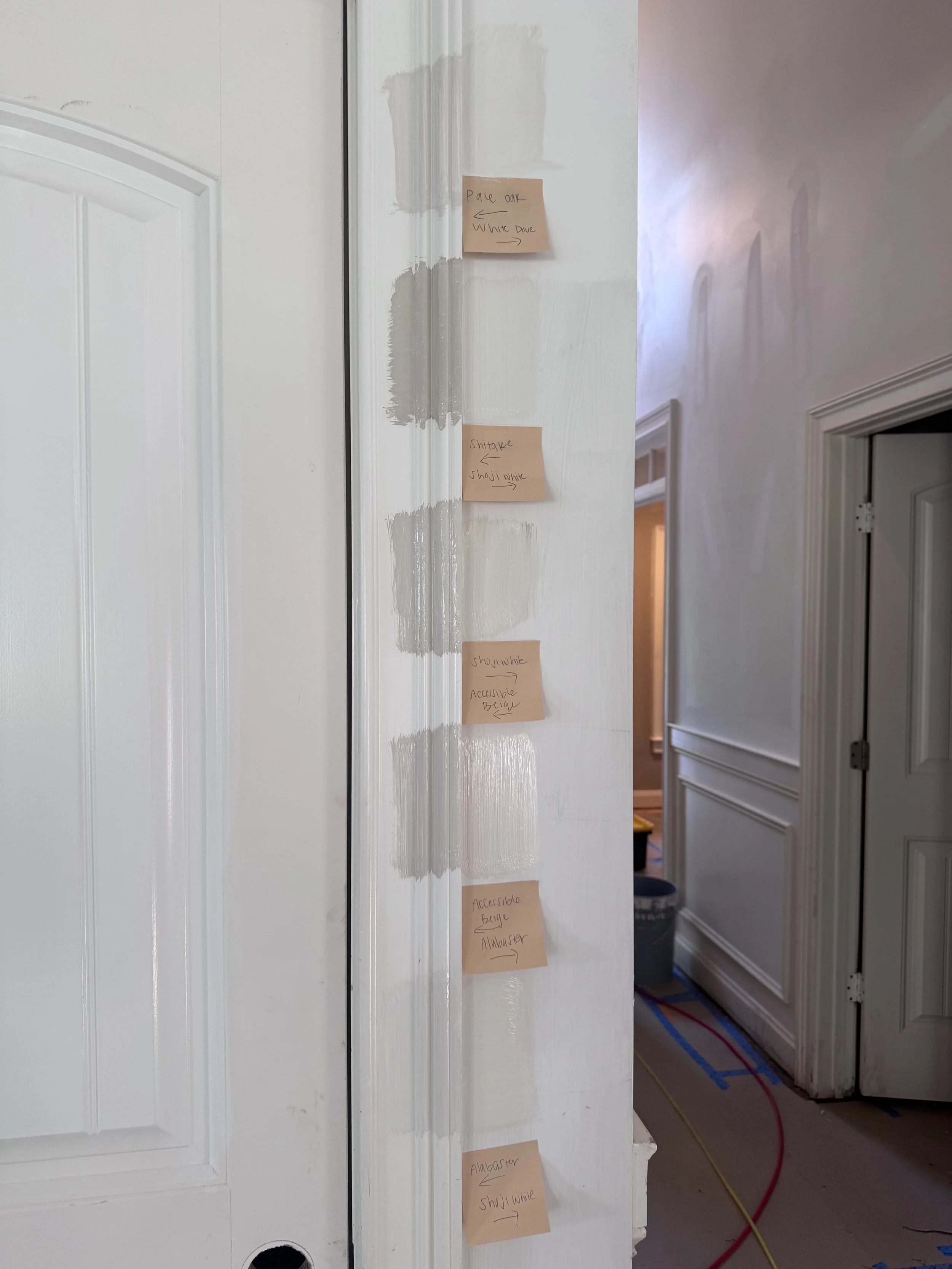
Trim and wall paint swatches.
A Soft, Lived-In Foundation
We started with a warm white for the main living areas. The goal was to keep the space feeling light and open, while avoiding anything too crisp or clinical.
This shade acts as a quiet foundation—allowing natural light, textures, and furnishings to take the lead while still adding depth to the walls. It shifts beautifully throughout the day, creating a space that feels dynamic yet grounded.
Clean Contrast in the Details
For the trim and millwork, we introduced a slightly darker neutral. This subtle contrast helps define architectural details and adds a level of polish that instantly elevates the home.
It’s a small shift, but one that makes a significant difference in how finished the space feels.
Why Paint Selection Matters More Than You Think
Paint doesn’t exist in isolation. It’s constantly interacting with light, materials, and surrounding finishes. The same color can read completely differently depending on the environment.
That’s why we always test in real conditions and consider every element in the space before finalizing a palette.
Final Thoughts
The success of this palette comes down to balance—soft but not flat, cohesive but not monotonous, elevated without feeling overdesigned.
When paint is chosen with intention, it becomes more than just a backdrop. It becomes the foundation for everything that follows.
Considering a refresh?
At Vessoul Design, we approach every detail with purpose—because the right palette truly changes everything.